Building the MVP for Testlify: Designing a Scalable, User-Driven Talent Assessment Platform
Testlify is a talent-assessment platform enabling businesses to hire efficiently through skill-based, unbiased evaluation. It delivers data-driven insights from customizable tests, helping recruiters identify top talent faster and more objectively.
PROJECT OVERVIEW
UI/UX Designer
1 PM, 2 PD, 10+ engineers + more
This case study outlines my experience contributing to the MVP of Testlify, a B2B SaaS product in the talent-assessment space.
Testlify helps organizations streamline recruitment through data-driven, customizable skill tests.
As a Product Designer joining during its early build stage, I learned how a product evolves from concept to execution — collaborating across functions, balancing design vision with business goals, and shipping experiences that shaped the platform’s first user journey.
DISCOVERY
01
It all started with
In December 2022, I moved to Mumbai to join Testlify, a startup founded by Abhishek Shah, a tech entrepreneur with over a decade of experience. The company had just started scaling its product after a successful concept validation phase.
02
Understanding the process, blockers and roadmap
I became part of a multidisciplinary team of ~40 members — including Product, Engineering, Marketing, Sales, and Design.
We collaborated daily via Slack for communication and JIRA for sprint tracking and cross-team visibility.
This phase was my first deep exposure to how real-world product teams operate — from scoping sprints to managing dependencies and iterating on design feedback in a startup setting.
EXECUTION
How design team functioned
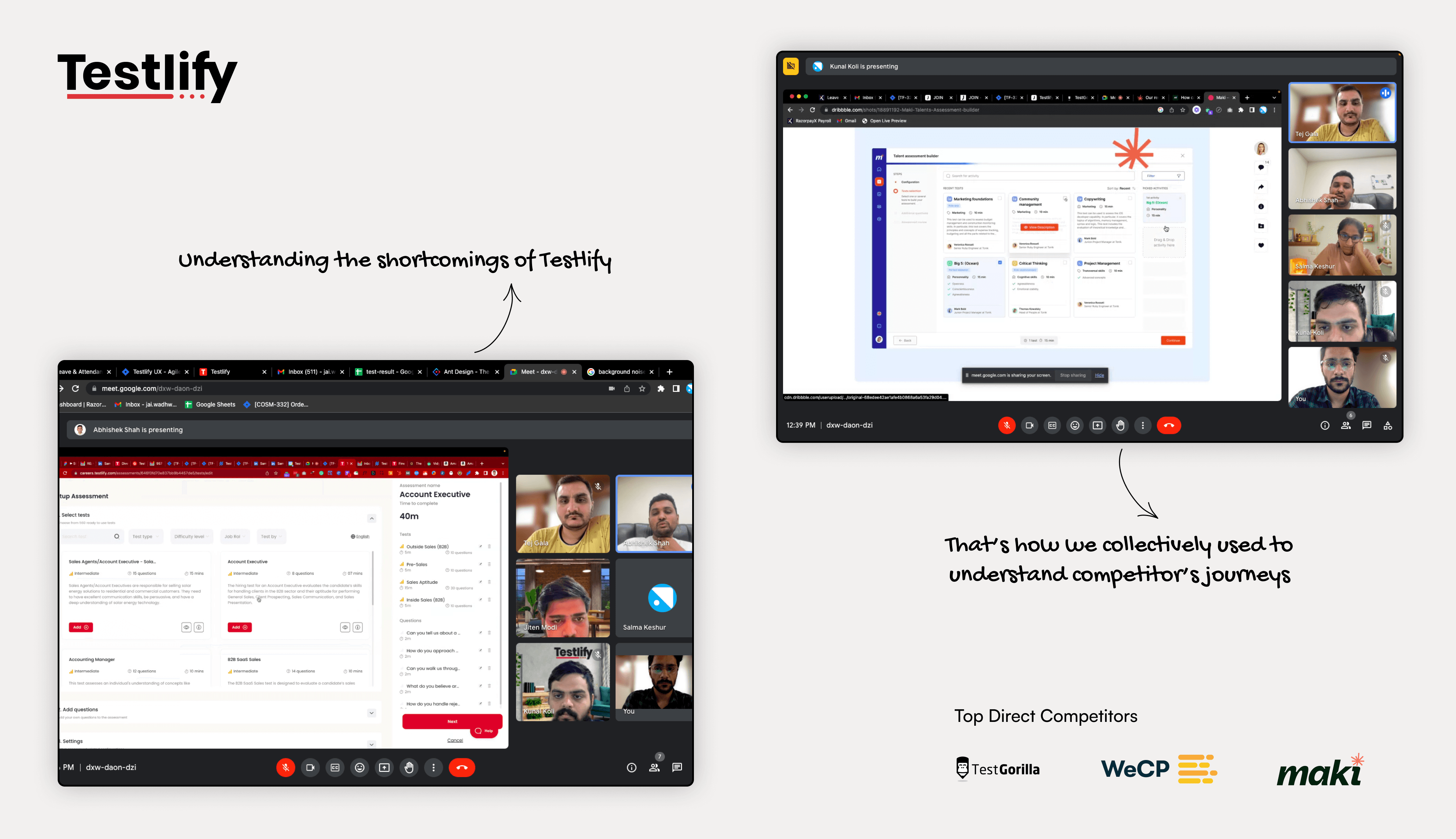
As part of a three-member design team (Lead + Associate + Myself), we worked in tight feedback loops with the product and business teams. Our north star was to design an intuitive, scalable, and competitive assessment platform that would differentiate Testlify from established players like TestGorilla, WeCP, and Maki People.
Key responsibilities and workflows included:
Competitor Analysis: Conducted benchmark studies to identify UX gaps and define differentiation opportunities.
User Feedback Integration: Gathered feedback from early adopters to uncover usability issues and align iterations with real user needs.
Cross-Functional Collaboration: Partnered with developers and the founder to ensure design goals aligned with business outcomes and technical feasibility.
Design System Foundation: Established reusable components and variable tokens in Figma, ensuring UI consistency and faster design-to-development handoff.
This hands-on phase taught me how to operate within a lean design team — balancing creative problem-solving with the execution discipline required in an early-stage SaaS environment.
FINDINGS
Feedback Loop
Actively integrated user feedback into design iterations, refining flows to better align with recruiter and candidate needs and improving overall usability.
Competitors in the Market
Analyzed platforms like WeCP, Maki People, and TestGorilla to identify industry best practices, UX gaps, and strategic differentiators that shaped Testlify’s product roadmap.
Figma 101
Built and maintained scalable Figma components, design tokens, and layout patterns to create a unified design system — accelerating UI delivery and improving cross-team consistency.
Scalable Innovation
Focused on modular interface patterns and adaptive layouts that could grow with the product’s evolving feature set, ensuring scalability without compromising simplicity.
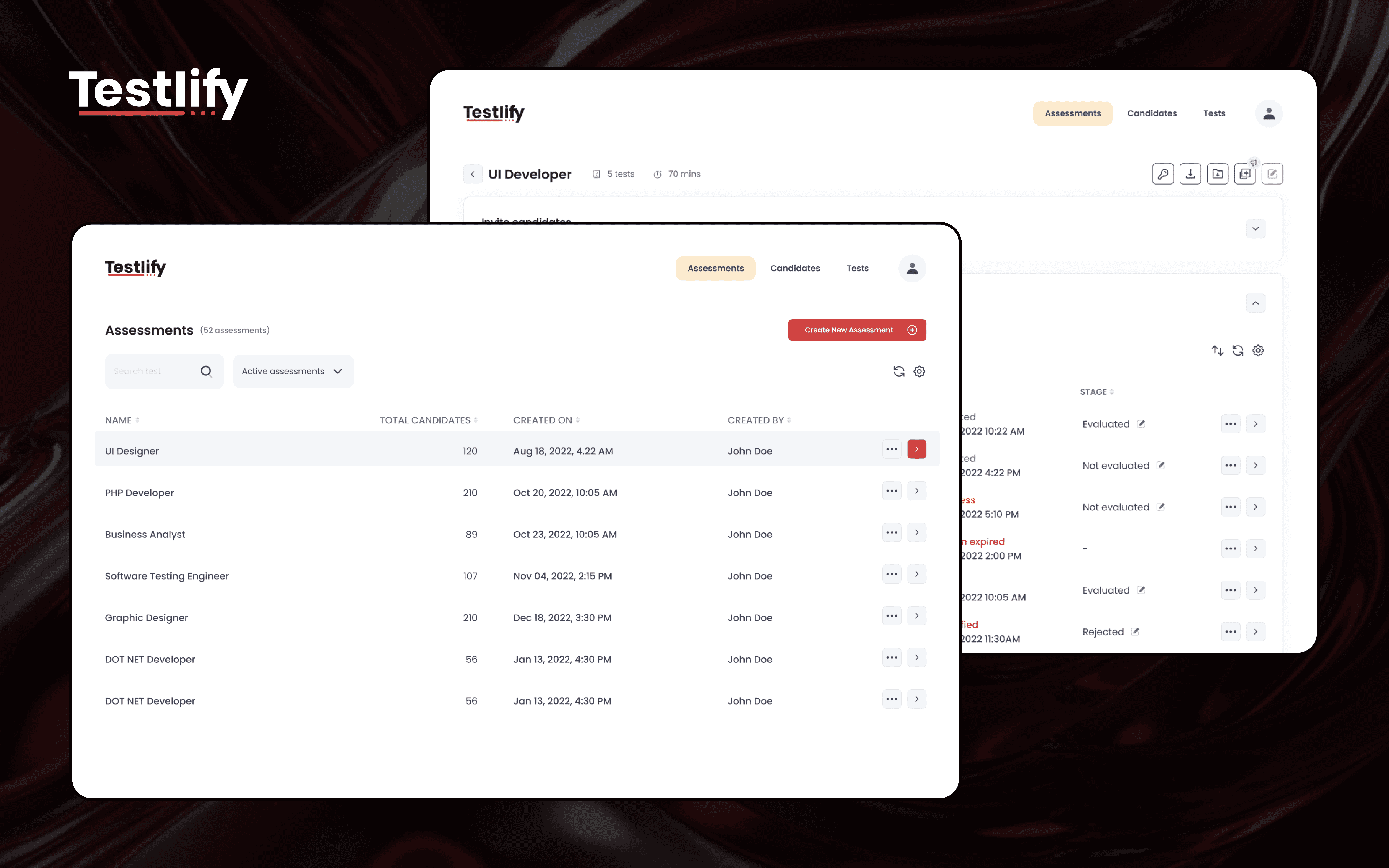
Key Design Contribution: Candidate Detail Page
A cornerstone of the platform, the Candidate Detail Page was where recruiters reviewed test results, answers, and performance metrics.
I redesigned the page architecture to improve clarity and decision-making efficiency by:
Streamlining information hierarchy for better readability.
Introducing clear visual groupings for key performance indicators.
Enhancing data-visualization elements to make candidate insights instantly interpretable.
Improving interaction design for smoother navigation between candidate records.
Impact:
Reduced recruiter evaluation time by approximately 25%.
Enhanced user satisfaction in early pilot feedback sessions.
Established a repeatable layout framework later adopted across multiple dashboard views.
In a fast-paced startup environment, our strategy prioritised quick releases—most feature improvements were driven by user feedback collected through a global tracker, ensuring every iteration addressed real user needs.
Through iterative design, collaboration, and constant user feedback, we transformed Testlify’s MVP into a functional, data-driven product that delivered a smoother assessment experience for recruiters and candidates alike.
This early-career project laid the foundation for how I approach product design today — combining research, systems thinking, and collaboration to solve user problems at scale.
Learning the art of Figma early in my career helped me immensely in my early days.
IMPACT
Based on internal data and user feedback, last recorded in May 2023
